In early 2025, Manifesto underwent a rebranding process which led to a new visual identity. We sat down with our Art Director, Marikki Perhiö, to learn about the inspiration behind our new brand visuals and what it represents for Manifesto.
The evolution of our new visual identity
Our goal was to breathe new life into how we look and communicate in this world. What began as a simple visual refresh soon developed into a complete reimagining of our brand identity. We focused on elements that genuinely reflect who we are and the expertise we bring to the table.
The inspiration for our new brand colours comes from the breathtaking views from the 12th floor of our previous office in Helsinki. Over the years, the ever-changing weather, colours, and sunsets seen from that vantage point became a key influence. We chose a rich, dark evening sky blue as our primary colour. Soft violet and peach hues evoke the beauty of clear-day sunsets, sparkling against the dark sky. This new palette is complemented by modern typography, which adds a fresh, contemporary feel to our updated brand.

What our new visual identity says about us?
The new visual identity conveys our solid expertise, boldness, and our ability to approach challenges from different perspectives. The deep, dark blue represents professionalism and expertise, while the vibrant, modern accent colours symbolize innovation and creative thinking. It also reflects our adaptability in an ever-evolving world, an essential trait for a communications agency.
The meaning of our updated brand symbol
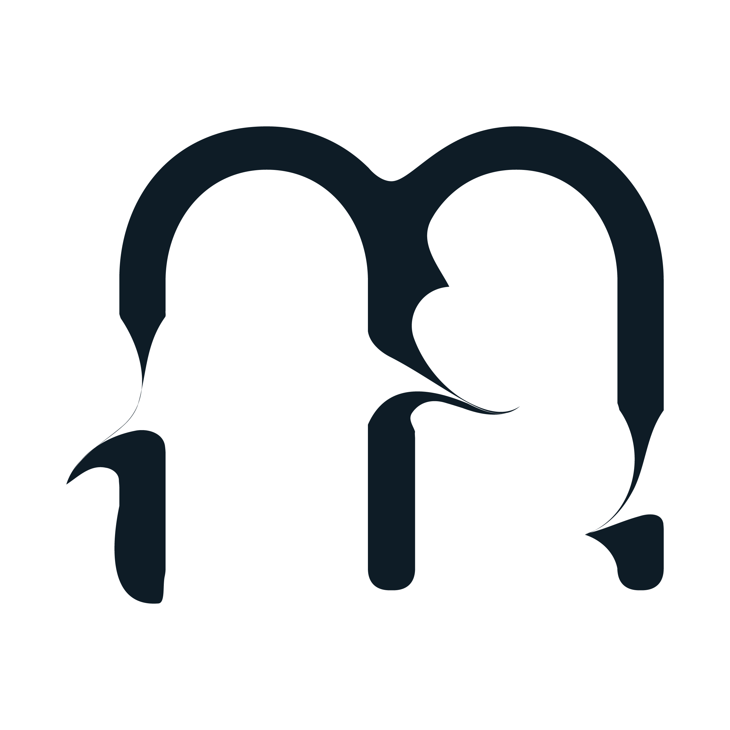
Our updated brand symbol is an organic, dynamic design that remains strong and versatile. It’s a multi-dimensional element that we incorporate in various forms across our materials. The new symbol has sparked a lot of curiosity, which is exciting – some see it as a torn letter “M,” while others interpret it as two people engaged in conversation. It’s almost like a personal inkblot test where every interpretation is valid. Accompanying the symbol is our updated text logo, which has been updated to match the new typography.
Altogether, our refreshed visual identity challenges the old and brings new energy to our Manifesto brand.

